A computational understanding of Uniform Manifold Approximation and Projection (UMAP)
Published:
Uniform Manifold Approximation and Projection (UMAP) is a nonlinear dimensionality reduction technique developed by McIness et al. in 2018. Though its use is often called into question in the biological sciences, it has become a key visualization tool for many computational biologists wanting to tease apart important differences between cellular transcription or genetic profiles. While UMAP has been widely adopted as the state-of-the-art in nonlinear dimensionality reduction, it is often poorly understood by its users, leading to its misuse. The difficulty in understanding UMAP is in part due to the tremendous effort by the original authors in exposing mathematical ideas that ground UMAP as the first graph-based approach with theoretical understanding of its functionality. The authors use ideas from Riemannian geometry and algebraic topology to construct the theoretical framework on which UMAP is built. It is then good news that UMAP can be thoroughly understood from an entirely computational perspective.
This post will be a guide through UMAP from the perspective of a computational scientist. We will explore thoroughly the key steps involved in the exceedingly popular nonlinear dimensionality reduction technique and even use the popular Python programming language to compute the embedding. Credit to Nikolay Oskolkov for this post which helped me to parse through the math in the original UMAP manuscript and motivated this post.
import numpy as np
import seaborn as sns
import scipy as sp
import matplotlib.pyplot as plt
from matplotlib import cm
from mpl_toolkits import mplot3d
plt.style.use('dark_background')
plt.rcParams.update({'font.size':23});
plt.rcParams.update({'axes.linewidth':1.5})
plt.rc('lines',linewidth=2);

from sklearn.metrics.pairwise import euclidean_distances
from sklearn.manifold import SpectralEmbedding
from scipy.optimize import curve_fit
UMAP operates in two steps and can ultimately be understood in terms of, construction of, and operations on a weighted graph. The two steps are i) high-dimensional graph construction, and ii) low-dimensional layout optimization. We will go over both steps in detail and avoid the Riemannian geometry and algebraic topology notation given in the original paper – in hopes of building a more intuitive and computational understanding of the approach
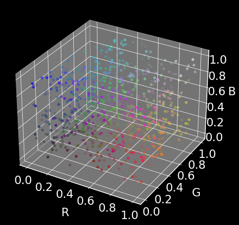
The dataset
We will generate 1000 random datapoints of dimension 4. The dimensions will represent (R, G, B, alpha), i.e., a representation of a color and transulency.
np.random.seed(2)
data = np.random.rand(1000, 4)
fig = plt.figure(figsize=(8,8))
ax = plt.axes(projection='3d')
ax.scatter(data[:,0],data[:,1], data[:,2],c=data)
plt.xlabel('R',labelpad=20)
plt.ylabel('G',labelpad=20)
ax.set_zlabel('B',labelpad=10)
plt.show()
Our goal is to represent the 4D color space in only two dimensions using UMAP (almost from scratch).
High-dimensional graph construction
Pairwise distances squared
The distance between point $i$ and point $j$ are used as a starting point to construct the high-dimensional graph in UMAP.
dist = (euclidean_distances(data, data))**2
fig,ax = plt.subplots(1,2,figsize=(13,6))
sns.heatmap(dist[0:100,0:100],cmap='Greens',ax=ax[0])
sns.histplot(dist[0],ax=ax[1],color='tab:blue')
sns.histplot(dist[-1],ax=ax[1],color='tab:orange',alpha=0.6)
ax[0].set_title('Distances between data points',fontsize=21)
ax[1].legend(['pt 1','pt -1'])
ax[1].set_xlabel('Pairwise distances')
plt.tight_layout()
plt.show()
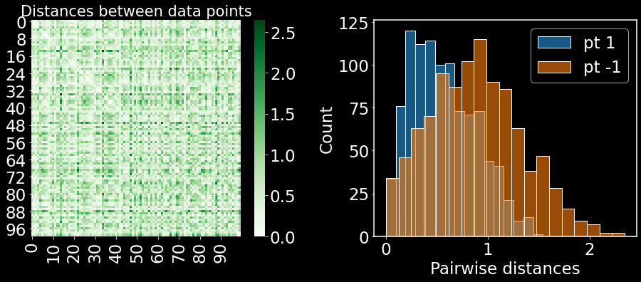
On the left are the pairwise distances between all data points. On the right, we are plotting the distances in a histogram for the first and last points in the dataset. Note how the distributions are distinct. This distribution plays a crucial role in defining the transformed distances for each data point, as we will discuss in the next few sections.
High-dimensional distances are untrustworthy
It has been shown, under very specific circumstances, that distances between points in high dimensions converge to a constant. This is known as the curse of dimensionality – however it is very poorly understood. One thing we can be certain of though is that in all probability the data points collected from physical and biological systems are not able to fill all of Euclidean space. Therefore reducing dimensionality makes intuitive sense. On top of that, we don’t want to trust the high-dimensional Euclidean distances – UMAP works with transformed distances. The transformed distances are termed probabilities and we will soon see why that is.
In fact, UMAP defines a distinct metric (distance function between points) for each data point. If there are $N$ data points, there will be $N$ distinct metrics defined. This is done for the following reasons:
i) the collected data are assumed to lie uniformly on the manifold which generates the data,
ii) the manifold is locally connected.
Thinking about i), if we have data points in ambient (Euclidean) space that are dense in one region and sparse in another, we must transform the distances to reflect that they are actually equispaced on a manifold. This leads to one additional change to the high-dimensional distances, i.e. a locality parameter which depends on the density which we will call $\sigma_i$. Thinking about ii) we must have that each data point is “close” to at least one other data point, this leads to the second addition to the high-dimensional distances which is a “single nearest neighbor” parameter $\rho_i$.
RBF kernel for transformed high-dimensional distances
Radial basis functions (RBFs) are used widely through machine learning applications. Here we will use them to transform high-dimensional distances into probabilities that data points are connected. RBFs take the form
$ w_{i \mid j} = \exp(- \lVert x_i - x_j \rVert ^2/L) $
where $ \lVert x_i - x_j \rVert $ is the Euclidean distance between points $i$ and $j$ and $L$ is a length scale parameter for the kernel. Let’s quickly see why we can start the think of distances passed through this kernel as “probabilities” (I would prefer to call them affinities, and so will use them interchangeably).
x = np.linspace(0,10,100)
y = np.exp(-(x**2/10)) # here x is the notation used for the distance between two points
plt.figure(figsize=(8,6))
plt.plot(x,y,lw=3)
plt.xlabel(r'$d(i,j)$')
plt.ylabel(r'$w_{i|j}$',fontsize=28)
plt.show()
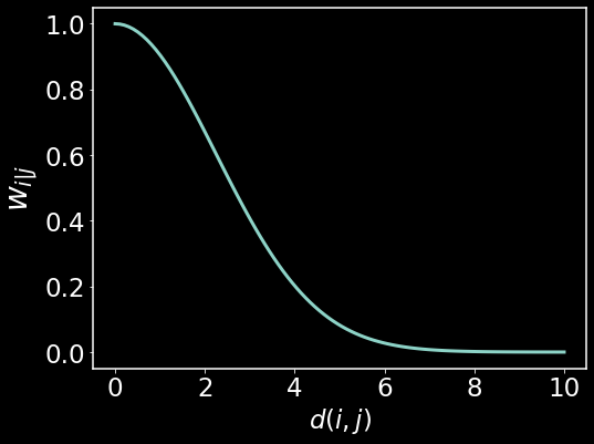
Here we are visualizing the distances between point $i$ and $j$, denoted $d(i,j)$ along the x-axis and how they get mapped to affinities denoted as $w_{i\mid j}$. $w_{i\mid j}$ is simply the affinity that point $i$ has for point $j$. This can be an asymmetrical quantity – $w_{i\mid j} \neq w_{j \mid i}$. We see that as the Euclidean distances grow large, the affinities become zero exponentially quickly. For small distances, we retain large affinties. This is the intuition behind the transformed distances. Next we will take a look at how to generate the local distances for each data point.
Local kernels ensure local manifold connectivity and uniform density of data on manifold
The RBF kernel defined in the previous section is unspecific to the data point $i$ for which the distance is being transformed. That is to say that there is no dependency on $i$ other than the data point itself. Here we will describe two modifications to the kernel function which make it specific to the data point $i$ and which defines local metrics to satisfy the two major assumptions outlined above and reiterated here:
i) the data generated lie uniformly on the manifold,
ii) the manifold is locally connected.
To satisfy condition ii), let’s include the “first nearest neighbor” parameter $\rho_i$ in the kernel as
$w_{i \mid j} = \exp(\frac{- \lVert x_i - x_j \rVert ^2 - \rho_i}{L})$.
If we take $\rho_i$ to be the distance to the nearest neighbor of point $x_i$, then we always ensure that affinity of point $i$ for its nearest neighbor will be equal to 1. This ensures local connectivity of the manifold, i.e. every point has a neighbor.
Next, let’s introduce the “locality” parameter which scales the distance metric depending on the density of point nearby to point $i$,
$w_{i \mid j} = \exp(\frac{- \lVert x_i - x_j \rVert ^2 - \rho_i}{\sigma_i})$.
Here we have replaced the scale parameter $L$ with a variable scale parameter $\sigma_i$ which depends on point $i$ (and its neighbors). In UMAP, $\sigma_i$ is set such that it satisifies the following equation
$\sum_{j=1}^k e^\frac{d(x_i,x_j)-\rho_i}{\sigma_i}= \sum_{j=1}^k w_{i \mid j} = \log_2(k)$
where $k$ is a chosen hyperparameter representing the number of nearest neighbors of all data points. Intuitively, we see that for a fixed $k$, if the sum of affinities for point $i$’s nearest neighbors is large, $\sigma_i$ must be small. Conversely, if the sum of affinities for point $i$’s nearest neighbors is small, $\sigma_j$ must be large. To visualize this, imagine that we are covering the graph with balls centered at each point $x_i$, where the radius of the ball is scaled inversely with the density of nearby points. We have just one step left in the high-dimensional graph construction. As stated earlier, the affinities are asymmetric. We want to now symmetrize the affinites.
# Define rho for each data point and visualize as a histogram

rho = [np.sort(dist[ii])[1] for ii in range(dist.shape[0])] # grabbing the first nearest neighbor (index 0 is dist of point to itself)

sns.histplot(rho);
plt.xlabel(r'$\rho$')
plt.show()
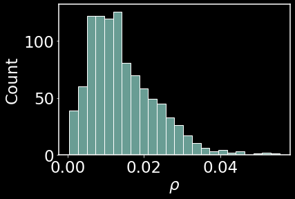
This histogram shows the frequency of first nearest neighbors. Most first neighbors are concentrated between 0.01 and 0.02 in distance away.
We next want to select $\sigma_i$ for each data point. The original UMAP manuscript uses binary search to select the parameter to satisfy the equation given above. Let’s also do the same:
def affinities(sigma, dist_row):
    """
    For each data point and corresponding pairwise distances (dist_row) compute
    affinity in high dimensions
    """
    dij = dist[dist_row] - rho[dist_row]
    dij[dij < 0] = 0 # set any negative distances after nearest neighbors scaling to be equal to zero (this is also done in manuscript)
    return np.exp(-dij/sigma) # local RBF kernel for data point corresponding to dist_row

def k(affinities):
    """
    For the affinities of each data point i, compute the number of nearest neighbors k. We will use this
    function in a binary search to hone in on the correct sigma that produces the fixed k that we set.
    """
    return 2**(sum(affinities))

# Code from Nikolay Oskolkov
def sigma_binary_search(k_of_sigma, fixed_k, tol=1e-5):
    """
    Solve k_of_sigma(sigma) = fixed_k w.r.t sigma by the binary search algorithm
    """
    sigma_min = 0
    sigma_max = 1000
    for ii in range(20):
        approx_sigma = (sigma_min + sigma_max) / 2
        if k_of_sigma(approx_sigma) < fixed_k:
            sigma_min = approx_sigma
        else:
            sigma_max = approx_sigma
        if np.abs(fixed_k - k_of_sigma(approx_sigma)) <= tol:
            break
    return approx_sigma
nneighbors = 10 # this is k
aff = np.zeros((data.shape[0],data.shape[0])) # matrix of high-dimensional affinities (row i says how pt_i is connected with pt_j)
sigma_array = [] # store sigmas for each pt here
for dist_row in range(data.shape[0]): # for all pts
    func = lambda sigma: k(affinities(sigma, dist_row)) # get affinities for pt_i for a fixed sigma_i, then compute k
    res = sigma_binary_search(func, nneighbors) # search for the sigma_i that gives k = nneighbors
    aff[dist_row] = affinities(res, dist_row) # get new affinities from the optimized sigma_i
    sigma_array.append(res)
sns.histplot(sigma_array)
plt.xlabel(r'$\sigma$')
plt.show()
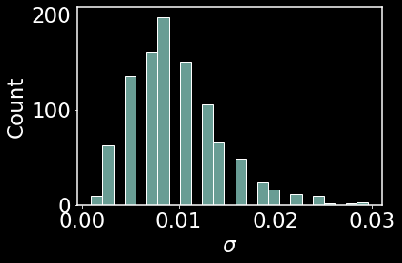
This is a visualization of the locality parameter for the dataset of 1000 points. Let’s also take a look at the specific distance metric for a few points
plt.figure(figsize=(8,6))
plt.plot(x,np.exp(-np.maximum((x**2 - rho[0]),0.0)/sigma_array[0]),label='pt 1',lw=3)
plt.plot(x,np.exp(-np.maximum((x**2 - rho[-1]),0.0)/sigma_array[-1]),label='pt -1',lw=3)
plt.plot(x,np.exp(-np.maximum((x**2 - rho[50]),0.0)/sigma_array[50]),label='pt 50',lw=3)
plt.legend()
plt.xlim(0,0.5)
plt.xlabel(r'$d(i,j)$')
plt.ylabel(r'$w_{i|j}$',fontsize=28)
plt.show()
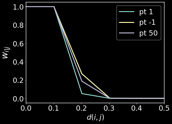
Here we see that there are three distinct metrics for the three data points. Again, this was done in order to satisfy the local connectedness constraint and the uniform manifold constraint. For more interesting datasets, we may see far more variation in the distance functions, however for our test dataset of colors, we do not see a lot of variation.
Symmetrization of the high-dimensional graph
In UMAP, the following symmetrization of the graph is motivated by probabilistic t-conorms. Since I don’t know what those are, I am going to simply state the equation and then ask the question: why?
Symmetrize weights as:
$w_{ij}=w_{i \mid j} + w_{j\mid i} + w_{i\mid j}w_{j\mid i}$
Why should this be the way symmetrization is done. Is it so as to further emphasize high affinities and low affinities with the product of the two. I’m not certain why the more often used symmetrization approach
$w_{ij} = \frac{w_{i\mid j} + w_{j\mid i}}{2}$
is not used. Would this make any difference in the results?
A = aff + aff.T + aff @ aff.T
plt.figure(figsize=(8,6))
sns.heatmap(A[0:100,0:100],cmap='Greens')
plt.show()
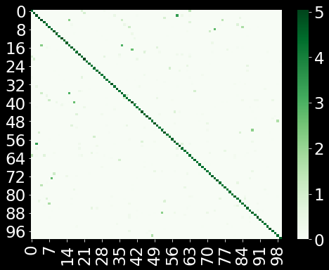
The above is the visualization of the affinities. Compare this to the original Euclidean distances we calculated in the ambient space. Each data point (row) has few connections (ideally $k=10$). Next, we will start to construct the low-dimensional layout
Constructing the low-dimensional graph
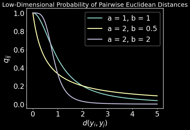
We now want to look for N low-dimensional (2 dimensional) embedded data points $y$ that preserve the high-dimensional affinities. We will call the affinities in low dimensional $q_{ij}$ and we need to define these affinities. UMAP defines them as
$ q_{ij}=(1+a(y_i-y_j)^{2b})^{-1} $
and there is a nice intuition for choosing this function. This function can be used as a smooth approximation of the piecewise continuous function
$(1+a(y_i-y_j)^{2b})^{-1} \approx \begin{cases} 1 ,& y_i - y_j < mindist\ \exp(-\lVert y_i-y_j \rVert _2+mindist), & otherwise \end{cases}$
What does this function look like?
y = np.linspace(0, 5, 1000)

low_dim_prob = lambda y, a, b: 1/(1 + a*y**(2*b))

plt.figure(figsize=(8,6))
plt.plot(y, low_dim_prob(y, a = 1, b = 1),lw=3)
plt.plot(y, low_dim_prob(y, a = 2, b = 0.5),lw=3)
plt.plot(y, low_dim_prob(y, a = 2, b = 2),lw=3)

plt.gca().legend(('a = 1, b = 1', 'a = 2, b = 0.5', 'a = 2, b = 2'))
plt.title("Low-Dimensional Probability of Pairwise Euclidean Distances",fontsize=20)
plt.xlabel(r"$d(y_i,y_j)$"); plt.ylabel(r"$q_{ij}$",fontsize=24)
plt.show()
Now we need to fit the parameters $a$ and $b$ of $q_{ij}$ to the piecewise smooth function using all datapoints. But we first want a decent low-dimensional layout intialized before doing that. UMAP uses Spectral Embedding (Laplacian Eigenmaps) to initialize the low-dimensional layout. This is a very simple algorithm that is widely used in machine learning for clustering and embedding. We start by defining the objective
$ min_{Y\in \mathbb{R}^{n \times p }} \; \; \sum_{ij}w_{ij}(y_i-y_j)^2 = min_{Y\in \mathbb{R}^{n \times p }} \;\; tr(Y^\top L Y) $
Some intuition behind the objective: If two points ($x_i, x_j$) are far apart ($y_i - y_j=0)$ $w_{ij}=0$. The term does not contribute to the objective. If two points ($x_i, x_j$) are close ($y_i - y_j)$ needs to be made small because $w_{ij}$ is large.
The solution is given by the eigenvectors of the Laplacian matrix $L$ of the high-dimensional graph we constructed earlier.
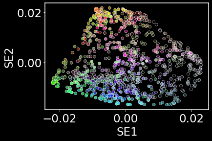
Initializing the low-dimensional layout
np.random.seed(42)
model = SpectralEmbedding(n_components = 2, n_neighbors = nneighbors) # initialization using the eigenvectors of the graph laplacian
y = model.fit_transform(data)
# Visualizing the low-dimensional initialization given by Laplacian Eigenmaps
sns.scatterplot(x=y[:,0],y=y[:,1],c=data)
plt.xlabel('SE1'); plt.ylabel('SE2')
plt.show()
Fitting the low-dimensional probability parameters of $q_{ij}$
UMAP takes a nonlinear least squares approach to fitting the parameters $a$ and $b$ in $q_{ij}$
def low_dim_affinities(y_dist,a,b):
    return 1 / (1 + a*y_dist**(2*b))

def piecewise_smooth_f(y_dist, min_dist=0.2):
    y = []
    for ii in range(len(y_dist)):
        [y.append(1.0) if y_dist[ii] <= min_dist else y.append(np.exp(-y_dist[ii] + min_dist))]
    return y
low_dim_dist = euclidean_distances(y,y)
low_dim_dist = euclidean_distances(y,y)**2
p , _ = curve_fit(low_dim_affinities, low_dim_dist[1], piecewise_smooth_f(low_dim_dist[1]))
a=p[0]; b=p[1]
f'a={p[0]}, b={p[1]}'
'a=0.08959315055139998, b=1.6758193089427018'
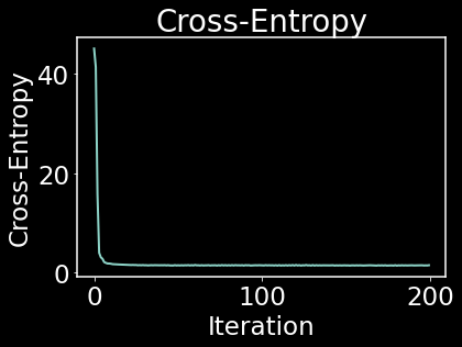
Optimizing the low-dimensional graph layout
UMAP optimizes the cross-entropy between the high and low-dimensional affinities. As we will see later, the cross-entropy minimization allows the preservation of both local and global structure. A similar algorithm called t-SNE optimizes the KL-divergence between the high and low-dimensional affinities. We will also see that the KL-divergence does not care about preserving global structure.
# Code from Nikolay Oskolkov
def prob_low_dim(Y):
    """
    Compute matrix of probabilities q_ij in low-dimensional space
    """
    inv_distances = np.power(1 + a * np.square(euclidean_distances(Y, Y))**b, -1)
    return inv_distances

def CE(P, Y):
    """
    Compute Cross-Entropy (CE) from matrix of high-dimensional probabilities
    and coordinates of low-dimensional embeddings
    """
    Q = prob_low_dim(Y)
    return - P * np.log(Q + 0.01) - (1 - P) * np.log(1 - Q + 0.01)

def CE_gradient(P, Y):
    """
    Compute the gradient of Cross-Entropy (CE)
    """
    y_diff = np.expand_dims(Y, 1) - np.expand_dims(Y, 0)
    inv_dist = np.power(1 + a * np.square(euclidean_distances(Y, Y))**b, -1)
    Q = np.dot(1 - P, np.power(0.001 + np.square(euclidean_distances(Y, Y)), -1))
    np.fill_diagonal(Q, 0)
    Q = Q / np.sum(Q, axis = 1, keepdims = True)
    fact=np.expand_dims(a*P*(1e-8 + np.square(euclidean_distances(Y, Y)))**(b-1) - Q, 2)
    return 2 * b * np.sum(fact * y_diff * np.expand_dims(inv_dist, 2), axis = 1)
# apply gradient descent to optimize the low dim layout

LEARNING_RATE = 1
MAX_ITER = 200

CE_array = []
for i in range(MAX_ITER):
    y = y - LEARNING_RATE * CE_gradient(A, y)
    CE_current = np.sum(CE(A, y)) / 1e+5
    CE_array.append(CE_current)

plt.figure()
plt.plot(CE_array)
plt.title("Cross-Entropy")
plt.xlabel("Iteration"); plt.ylabel("Cross-Entropy",)
plt.show()
plt.figure()
plt.scatter(y[:,0], y[:,1], c = data, cmap = 'viridis', s = 50)
plt.title("UMAP on dataset of colors", fontsize = 20)
plt.xlabel("UMAP1", fontsize = 20); plt.ylabel("UMAP2", fontsize = 20)
plt.show()
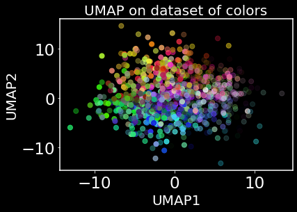
It does kind of look like we have learned a color wheel – sort of. It’s never great advice to overinterpret a visualization produced by nonlinear dimensionality reduction. However, we do still want to see how UMAP preserves global structure. Let’s first take a look at t-SNE and it’s loss function.
KL-divergence
x = np.arange(0, 2, 0.001)
y = np.arange(0, 2, 0.001)
X, Y = np.meshgrid(x, y) # made up high and low dim affinities
Z = np.exp(-X**2)*np.log(1 + Y**2) # an approximation of the KL-divergence
plt.figure(figsize=(7.5,6))
plt.contourf(X,Y,Z,cmap='Spectral_r')
plt.colorbar()
plt.title('KL-Divergence in t-SNE',fontsize=23)
plt.xlabel('Distance bw pts in high-dim, X');
plt.ylabel('Distance bw pts in low-dim, Y');
plt.show()
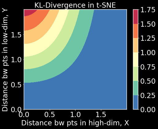
What we see here is that local structure is preserved because KL-divergence is large when $X$ is small but $Y$ is large. This is good. But we also see that when $X$ is high, $Y$ can be high or low and KL-divergence will be small. The objective will not be affected by this latter case. In that sense, t-SNE has a hard time preserving global structure due to the choice of KL-divergence. Let’s now look at UMAP’s cross-entropy loss function in the same way.
Cross-entropy and using UMAP like distances
Z = np.exp(-X**2)*np.log(1 + Y**2) + (1 - np.exp(-X**2))*np.log((1 + Y**2) / (Y**2+0.01))
# approximation of cross-entropy
plt.figure(figsize=(7.5,6))
plt.contourf(X,Y,Z,cmap='Spectral_r')
plt.colorbar()
plt.title('Cross-entropy in UMAP',fontsize=23)
plt.xlabel('Distance bw pts in high-dim, X');
plt.ylabel('Distance bw pts in low-dim, Y');
plt.show()
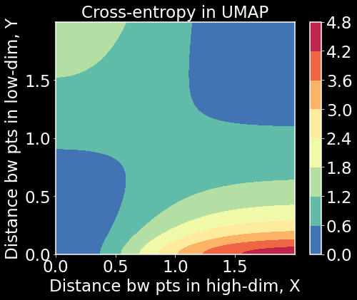
What we notice here is that when both $X$ and $Y$ are small or large, cross-entropy is small. When one is small and the other is large, cross-entropy is large. To minimize the cross-entropy, we have to balance both local and global structure. This has further implications for how to interpret the manifold structure. We may get to that at a later date. For now, I hope this post helped clear up the algorithmic nature of UMAP and to help connect it to commonly used terminology in graph theory and machine learning.
Feel free to reach out with questions or if you find any problem with what’s written in this post. Thanks!